Evolution of the CMT logo
CMT was founded in the early 1970s and its history is full of passion, hard work, sweat and collaboration. It’s a story of one woman who dedicated her entire life to this company, as perfectly represented by the changes in the company’s logo

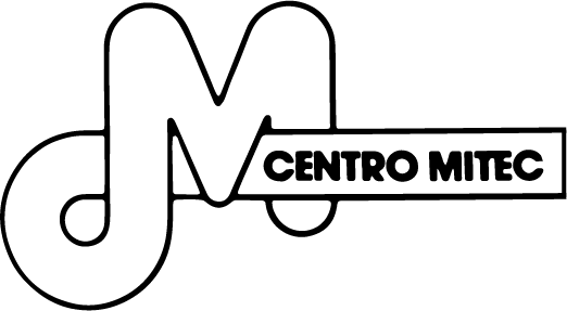
Cristina Ajmone, a conference interpreter and professional translator, set up a small interpreting and translation studio in the heart of Milan, Centro MITEC (Milano Interpreti Traduzioni e Congressi – Milan Interpreters, Translations and Conferences). She immediately began working on translation and interpreting for high-end customers, including listed companies and from the world of finance, before setting up a real-time transcription service for shareholders’ meetings shortly after.
In 1989, Centro MITEC was first joined and then replaced by a new limited liability company: the CMT that we know today. The company’s acronym was made even shorter to give a sense of renewal, while the logo was entirely redesigned. The colour red underlines strength and passion, the long angular outlines represent a clear shift in the company’s intentions, towards an even stronger presence in the world of translation and transcription.

In the 33 years since, CMT S.r.l. has become a point of reference for translation, transcription and interpreting services for legal and corporate departments at companies listed on the FTSE MIB. Major companies in the field of pharmaceuticals, automobiles, telecommunications, sports, energy and gas became and still are part of our prestigious customer base.
Technological services experienced the shift from analogue to digital and we entered the era of fast, hyper-fast and ultra-fast connection. Audio/video conferences, remote simultaneous interpreting and real-time transcriptions were the natural evolution of the services we provided.
CMT has never stopped growing, evolving, involving and attracting new project managers who passionately accomplish the company’s vision, even more so now, under the leadership of Valentina Ajmone, a Business Economics graduate and specialist in organisation and computer systems. With renewed vigour and an eye for continuous development of the company’s various businesses, she was the clear choice to take over the management and evolution of CMT.
the new CMT logo
CMT’s new logo conveys strength, skill, technology, cohesion, innovation and efficiency. The acronym has evolved, channelling a new and richer meaning: Communication Meets Translation highlights the increasingly more international nature of the language service provider, which aims at building bridges between cultures through its multilingual communication services. As CMT has grown and worked with larger and larger companies, it has never forgotten its careful attention to detail, a perpetual expression of the quality this LSP strives for.


